💜 HTML,CSS
HTML&CSS 17일차 (정리x)
Genie_.
2024. 3. 23. 22:09
728x90
반응형
<!DOCTYPE html>
<html lang="en">
<head>
    <meta charset="UTF-8">
    <title>선형/원형 그라데이션</title>
</head>
<style>
  div {
    display: inline-block; /* inline으로만하면 width height 값 안먹음 */
    width: 500px;
    height: 300px;
    border-radius: 10px;
  }
  .grad1{
    background-color: blue;
    /* (0,0)이 기준이니, 오른쪽 밑으로 blue에서 white로 그라이언트 만들어라 */
    background: linear-gradient(to right bottom, lightblue, lightgoldenrodyellow);
  }
  .grad2{
    background-color: green;
    /* deg: 각도. 45deg => 45도 => 오른쪽 위 방향 */
    background: linear-gradient(45deg, lightpink, mediumpurple);
  }
  .grad3{
    background-color: red;
    /* 30% 위치에 색상 중지점을 지정한다 */
    background: linear-gradient(to bottom, yellowgreen,lightgoldenrodyellow 50%, aquamarine);
  }

  /***********************************************/

  .rad1{
    background-color: mediumpurple;
    /* 타원형으로 흰색, 노란색, 빨간색으로 바뀌는 원형 그라데이션 */
    background: radial-gradient(white, lightyellow, indianred);
  }
  .rad2{
    background-color: mediumpurple;
    /* 원형으로 흰색, 노란색, 빨간색으로 바뀌는 원형 그라데이션 */
    background: radial-gradient(circle ,white, lightyellow, indianred);
  }
  .rad3{
    background-color: mediumpurple;
    /*
      closest-side : 그라데이션 중심에서 가장 가까운 측면에 닿을 때까지
      closest-corner: 그라데이션 중심에서 가장 가까운 꼭짓점에 닿을 때까지
      farthest-side: 그라데이션 중심에서 가장 멀리 떨어진 측면에 닿을 때까지
      farthest-corner: 그라데이션 중심에서 가장 멀리 떨어진 꼭짓점에 닿을 때까지
     */
    background: radial-gradient(closest-side, white, lightyellow, palevioletred);
  }
  .rad4{
    /* 20%에서 시작해서 흰색에서 파란색으로 바뀌는 원형 그라데이션 */
    /* 가운데에서 시작하는 것이 아니라 중심 위치를 지정할 수 있다. */
    background: radial-gradient(circle at 20% 20%, ghostwhite, cornflowerblue);
  }

  /*************************************************************/

  .pat1{
    background: repeating-linear-gradient(yellow, palevioletred 50px, palevioletred 20px, darkred 20px);
  }
  .pat2{
    background: repeating-linear-gradient(black, black 20px, white 20px, white 40px);
  }

</style>
<body>
  <section>
    <div class="grad1"></div>
    <div class="grad2"></div>
    <div class="grad3"></div>
  </section>
  <section>
    <div class="rad1"></div>
    <div class="rad2"></div>
    <div class="rad3"></div>
    <div class="rad4"></div>
  </section>
  <section>
    <div class="pat1"></div>
    <div class="pat2"></div>
  </section>
</body>
</html>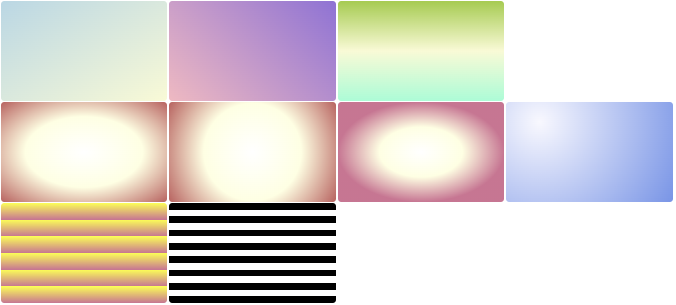
728x90
반응형